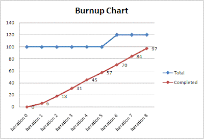
If you’ve read my previous posts on the subject you know that I love agile burn up charts for managing SCRUM style projects, particularly compared to burn down charts.
The problem is that burndown charts lack two essential pieces of information. First, how much work was actually accomplished during a given iteration (as opposed to how much work remains to be completed) and second how much total work the project contains (or if you prefer how much scope has increased each iteration).
What you might not know is how flexible they can be. In particular the example I gave last time has a problem. Can you spot it?
The problem is that the scope increase of 20 points in iteration six might very well have had zero impact on the actual deployment date. Those points might have all been low priority tasks that the team will work on after they deploy the initial 100 points. Wouldn’t it be nice if the burn up chart could convey priority information as well?
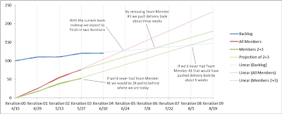
So that’s exactly what I did on my current project last week, and it appeared to be a big hit. And with the addition of some Excel trend lines the chart was able to convey a lot of insight into the project:
Obviously all that data is made up, but the chart still tells an interesting story:
- The customer hasn't been adding high priority tasks, perhaps because there is a hard deadline approaching
- Because of the customer’s restraint in adding high priority tasks the team can be fairly confident that they will finish all the high priority tasks by Iteration 3
- While the customer hasn’t added high priority tasks they have still been able to be agile by adding normal and low priority tasks
What’s really wonderful about this way of reporting is that it gives the customer the flexibility to add scope to future iterations while maintaining near term deadlines. In short it supports what agile is supposed to be about.
But why stop there? Depending on the story you need to tell or the scenario you need to evaluate perhaps you could incorporate team member contributions. For example:
In this example we can try to show what might happen if we remove a particular team member or if we’d never had a particular team member. What’s unique about this way or reporting is that it’s incorporating the backlog’s increasing trend into account. While it’s possible that the backlog may increase or decrease at a different rate with a different team makeup, it’s a better scenario than ignoring the rate of increase of the backlog all together.
Perhaps we could incorporate other information. Maybe bug vs. feature information. Or planned vs. actual (e.g. task slippage) information. It seems like there is a lot of potential. Any other ideas out there? Feel free to post in the comments or via twitter. If there’s enough interest I’d be happy to post another screencast similar to the last one I did on how to produce burn up and burn down with SharePoint and Excel except this time with trends and priorities.
So overall while these charts may be a little more complicated than a traditional burn down chart they would make an excellent talking point during a PowerPoint presentation, or as part of your iteration close out. And with a little training I bet just about any customer would learn to love the insight they provide.


